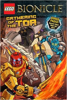
As the revamped title notes, the graphic novel portion of my project is no longer (was it ever?) going to be weekly. The graphic novels will happen when they happen at this point. With the deadline for dissertation chapters looming, I'll be keeping the comics on a daily basis, but the other stuff will happen when time permits. Today, I'm sitting in a hotel room in Banff on the side of a mountain, so time has permitted.
I'm a huge fan of the Lego BIONICLE franchise, so when it was announced a couple of years ago that it would be returning from its 5-year hiatus, I was thrilled. The first new models came out about a year ago, and though the story of the Toa has been available on the website since the get go, it's only in the last couple of months that the print media associated with the series has also returned. The comics aspect of the BIONICLE tale originally appeared as inserts in the Lego Club Magazine. Though the art was of varying quality, it was a generally good comic, and the price (free!) was always right.
I wish I could say the same of this particular graphic novel.
I'm not familiar with writer Ryder Windham, but he's apparently a pretty big name in the Star Wars expanded universe writings. I find this encouraging, as BIONICLE has always had the potential to be a thoroughly epic piece of fiction - that subtle hints of connections to the prior storyline are being dropped in this comic is proof of that. What I'm a little more concerned about is the quality of the art. Caravan Studio is based out of Indonesia, and their website offers some examples of comics art from what look like Marvel comics, though whether these are simply examples or from actual comics, I'm not sure. Regardless, the art in Gathering of the Toa is terrible compared to the art on the website. One of the most distinctive aspects of the Toa are their masks, and the toys are beautifully-sculpted pieces. In this comic, the masks look completely flat. Indeed, all of the characters seem to be lacking in actual, physical depth. It's one of the problems of comics, that it's a two dimensional medium attempting to depict a three dimensional (well, four dimensional) world. Unfortunately, the characters in these stories look like they live in Flatland. There's also the issue of the placement of word balloons, either coming from the wrong character (unless Toa Kopaka refers to himself in the third person, in which case I apologize), or placed in such a way that the flow of action is not properly represented. I notice this kind of balloon placement a lot in comics from Image and its clones in the early 90s, and I think it speaks to an artist, or artists, with a lot of enthusiasm, but not necessarily a great handle on the medium.
My favourite of the short stories in the book, "Mountain Terror," features Pohatu, Master of Stone and some young wolf-like creatures he befriends. Sadly, Pohatu's probably the worst-depicted character in the book, but the action sequences and the sparse dialogue in this story are very effective.
It's a pity that the art is so...amateurish (?) really, as these are stories that haven't been told anywhere else, online or off, about the new iteration of the series. And the stories themselves are actually pretty good. Old fans will have some concerns about the characterization of the Toa, but we're not 100% sure that they're really the same characters we loved from the earlier version of the series. Yet. The comics are definitely geared toward a younger audience, but they offer to the older fan some elucidation about the Protectors, elemental guardians and summoners of the Toa, and some interesting moments on the island of Okoto. I just hope that the art gets better.

No comments:
Post a Comment