Another cover that really hearkens back to the 90s for me. It really does have to be Finch's artwork, and the formative effect it had on comics at the time. But that's not all I should be talking about with this picture. There's a reason David Finch is considered one of the top illustrators of that era, and it's because he makes a character move. Have a look at the first couple of issues of New Avengers v.1. The sense of motion, of giant bodies in small spaces, of bodies flying through the air (both of and not of their own volition). The same, I think is true of this picture. Where Glory is coming from, and where she's landing, we don't know, but we definitely know that she's moving between places.
This might seem like a small thing, but there's plenty of artists out there who draw figures as if they're frozen in place, and the human body never is.
This is the David Finch variant of issue #2 of the Avatar series. I really do think Finch manages to mesh the two costumes, original and current, really nicely here.
Thoughts, reviews, rants, laments, and general chatting about the wonderful world(s) of comic books.
Showing posts with label David Finch. Show all posts
Apr 10, 2019
Feb 27, 2019
The Faces of Glory - Alan Moore's Glory #1 [Finch Variant, Avatar Press]
This must have been a bit of a coup for Avatar, wrangling a big name like Mr. Finch to do a couple of covers. And they're really very nice. This is a bit of a weird picture, though. It's certainly Glory post-battle. We see damage to her boot, and the cape looks a bit ragged. But she's also certainly got a bit of a come-hither look on her face. Not what one would expect post-battle, but then I've never been a mythic female superhero, so I don't really know.
This is the Finch variant of issue #1 of the Avatar series. I think Finch's pictures are actually the ones that most capture the spirit of the original Glory, rather than this reimagining. There's something of the 90s to them for me, though that may simply be that I associate Finch's style with the 90s. Y'know, in that he was instrumental in creating that style in the first place ;P
Jul 14, 2016
The 40 Years of Comics Project - Day 506: Batman: The Return, January 2011
With this epic piece of work, we'll take a brief break from the read-through of Morrison's run on the Bat. The contrast of Bruce as Batman with Dick as Batman is incredible, I have to say. And Bruce himself notes that Dick Grayson's version of Batman is far more likeable. There's also a remarkable contrast in how Bruce works with Damian. Over the last couple of issues, Damian has repeatedly asked what the ramifications of Bruce's return are for "Batman and Robin," obviously seeing that team as himself and Grayson. Damian is a closed off, reticent young man, so these little moments of sentiment, though masked in pomposity, are really lovely character notes. He likes working with Dick. This issue follows on directly from the last Morrison issue of Batman and Robin, giving us a glimpse of the foundations upon which Bruce is going to build the Incorporated brand. The sad part of this is that, partway through Morrison's story, DC dropped "The New 52" and, in the humble opinion of this blogger, fucked up their entire publishing line almost beyond redemption. We'll see how "Rebirth" does, I guess.
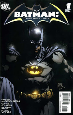
One thing I don't comment on very often is the actual material quality of the comics I read. Over the almost 70 years of comics history I have in the collection, the actual composition of the comics has undergone numerous changes in quality. This comic is an interesting one. The interior pages are as you'd expect, contemporary glossy pages, computer effects over traditional art. Pretty much a modern comic. But the cover is a little different. It's a heavier gauge of paper, to begin, though not quite cardstock. It's the finish on the cover that is interesting. Rather than a gloss, it's got a matte finish to it. The effect is nice, as there's no reflection from the shadow Batman is emerging from in the picture. When I teach my students to read poetry, I tell them that it's vital to remember that there's a title to many pieces, and this title helps us with our reading of the verse. This cover offers a similar function. Bruce, as Batman, emerges from a dense and true shadow, both literally and metaphorically. In contrast to the hyper-colourful covers of Batman and Robin, even the covers of the comics featuring the different versions of the characters give us subtle, or perhaps not so subtle, clues as to how the comic, and the character, will read.
So I think we'll take a week off. I've got some strange comics I want to read and blog about, and then we'll jump back into Batman, Incorporated, and see, as Bruce calls it, "the future of crime-fighting." Onward.
Jul 2, 2016
The 40 Years of Comics Project - Day 494: Batman #700, August 2010
"No matter when.
No matter where.
No matter how dark."
Though not technically a part of the "Return of Bruce Wayne" storyline, this anniversary issue of Batman offers a tiny little primer on time travel stories to get us ready for the convolutions of the "Return" story.
Well, maybe that's overstating things. It's a nice story for an anniversary, as it intertwines past, present, and future Batmans (Batmen?) in an adventure, though the locked room at the center of the story is not really a hard one to figure out. So much can be done with a time travel device. But, oftentimes, in depth story is not what an anniversary issue is about. It's about celebration, about seeing where a title has been and where it has the potential to go. With younger titles, it's also about relief to have made it this far, but very few hit the milestones that titles like Batman, Detective Comics, Action Comics, and all the old guard do.
For me, the best parts of this issue are the end bits that, while not partaking of the main storyline, offer visions and interpretations of what Batman has, and will, mean. The "And Tomorrow" chapter, illustrated by David Finch (who, I'll admit, is just a bit too Image-y for my tastes), gives tantalizing glimpses into possible future Batmen, heroes who may be part of the lineage, but also may be alternatives to one another. It's lovely to see the Batman and Robin of the 853rd century again, and Terry McGuinness - though isn't the presence of old Bruce there a bit of a giveaway? I'm not sure where the other two versions of the Bat that we see, one in a futuristic mega-city, one in a post apocalypse, come from, if they're canonical future versions or just extrapolations from Morrison's mind, but they demonstrate that Batman, or the idea of Batman at least, can function in the most diverse settings. "No matter when, no matter where." It's telling that the final pages bring us back to the present and picture everyman Commissioner Gordon shining the Bat Signal into the darkness, showing us that, regardless of the darkness of the costume and the character, Batman is hope and light.
But don't tell Bruce that. He'd just growl at us.
Onward.
Subscribe to:
Posts (Atom)