Pages

Showing posts with label Rick Veitch. Show all posts

Nov 12, 2020

The 40 Years of Comics Project - Day 2087: Neil Gaiman's Wheel of Worlds #0, April 1995


 Just how much involvement Neil Gaiman had in this comic is hard to determine, really, though the concepts definitely scream Gaiman. Lady Justice was one of the first comics I picked up as I was getting slowly back into the hobby in the mid-90s. I was drawn by the Dan Brereton covers, and Gaiman's name, but they never really drew me in. Having revisited the world of the Wheel of Worlds recently, it's a little more intriguing, though doesn't seem as fresh as it might have 25 years ago. I may well try to track down the Teknophage series, as the character is like an evil, flesh-eating Morpheus, and I'd love to know how his story spins out.

More to follow.

Mar 6, 2018

The 40 Years of Comics Project - Day 1105: Top Cow Convention Preview: European Edition, 2000

https://www.comics.org/issue/811342/


One of the cool things about my collection is that it's liberally seeded with what are commonly known as "premium" comics. These will be low print run special editions of other series offered for sale to the public through specialty services. Dynamic Forces, the purveyor of today's short comic, is one of the most successful that I know of. Each special edition is accompanied by a lovely certificate stating the print run and this particular issue's individual number.

I've only ordered from DF once or twice, and it was generally to get special comics that actually contained new story material from series I was following. I always thought it was a bit of a scam to withhold story from those who couldn't afford the premium, but I got sucked in anyway. But I think most of their business comes from selling variant covers of pre-existing comics. For instance, today's Top Cow sampler comes in two different covers - one where the characters are in vertical strips and one where they're more horizontally aligned. The interiors are literally the same. It's just the covers that are different. Variants like this are part of the hobby of collecting that I never really did get. I like having a choice of regularly-priced covers (Marvel are killing it with this practice these days), but I never really understood paying a premium for a cardstock or holofoil cover. As I've noted before, I gave up comics basically through the speculator boom of the late 80s and early 90s. I often wonder if I'd have been sucked into it had I still been a collector.

As for today's comic, it's some rough previews of three series. I'll admit, with my new respect for Top Cow's properties and their aesthetic, I was somewhat intrigued by all three. I kind of wonder why this particular preview was a premium comic. Perhaps it's simply that it's a European preview, different somehow from the North American one? But I have two copies of it, one with each cover, so I'm sure I'll pontificate about its premium-ness at least one more time during this project.

To be continued.

Sep 29, 2017

The 40 Years of Comics Project Friday Magazine 21: Epic Illustrated #6, June 1981

https://www.comics.org/issue/35402/


Okay. Time to blog this one.

I have to say that these magazines have tired me much more quickly than I thought they would. Though I'm still enjoying some of the features, there's a lot in this one, and admittedly the last one, that was just okay.

Perhaps this is why magazines are published on a monthly basis? So that there's a bit more distance between things, a palette cleanser.

(Just looked up palate and that last sentence was a completely unintentional pun!)

Back to Heavy Metal, next week? Or perhaps DW Weekly.

I don't want to suggest that the stories aren't well done. They are. But it really seems that the magazine is struggling to differentiate itself from Heavy Metal and the be Heavy Metal all at the same time. It's inevitable, as the artists who are represented in Epic Illustrated are likely discovering all of the European greats at the time, through Heavy Metal, like everyone else in North America. I'm curious to see what changes come over the magazine in the next few issues - many of the letters that are printed are offering suggestions on, or critiquing, the features, the style, of the magazine. I wonder how much the editors listen to their audience?

As always, it's great to see Rick Veitch's work anywhere. He's one of the few artists whose work I love that genuinely creeps me out. There is this unsettling visceral quality to his art that is both beautiful and discomforting. One of these days I'll (re)read his Can't Get No graphic novel and I'll still have no idea what to say about it. His Greyshirt miniseries, and the Tomorrow Stories stuff is some of the coolest looking comics I've ever seen. Today's "Shipmates" applies that viscerility to a spaceship, rusting and hanging in space.

Onward!

Sep 22, 2017

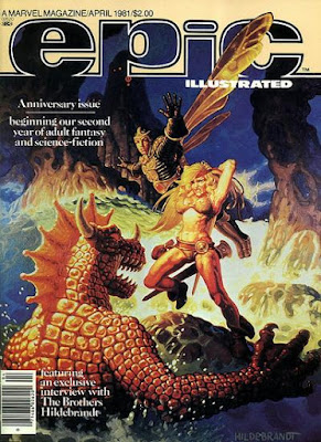
The 40 Years of Comics Project Friday Magazine 20: Epic Illustrated #5, April 1981

https://www.comics.org/issue/35265/

There's really a lot going on in each of these issues. I'm of two minds about this. Sometimes it's nice to have so much variety - granted that it's restricted in this case by its genre(s), though you can really get away with a lot in Science Fiction and Fantasy - enough that you can read a 100-page magazine and not get bored at all. On the other hand, keeping track of all of these narratives, from the continuing to the tiny, can be a bit much every now and again.

That said, I'm absolutely loving Jim Starlin's "Metamorphosis Odyssey," which I did not know was the first place that his famed character Dreadstar appeared. Now I'm intrigued to read that as well (though I have no issues of the series in the collection, unfortunately). There's also some more stuff from Mirko Ilic, which I linked to in the review of the first issue of the magazine. His comics are, as I noted in that earlier piece, genius. I wish there were more. So there's a lovely example of what this magazine is doing right. An ongoing series that's definitely engrossing, and small snapshot pieces that are pushing at boundaries. Today's story "Satri," written and drawn by Margaret Gallagher (who's got a shockingly low online presence) is another wonderful and innovative piece.

I think I could do with less text-piece content. There's an interview with the Hildebrandt Brothers, very important artists in fantasy art, but it takes up soooo much space, and I can only read so much about people holding forth on their artistic processes. I think the shorter text pieces are pretty great, especially the ones commentating on the medium in this pre-Maus world (as I noted last week), but the long ones are just a bit much.

My opinion, I guess, for what it's worth. Onward!

Sep 15, 2017

The 40 Years of Comics Project Friday Magazine 19: Epic Illustrated #4, Winter 1980

https://www.comics.org/issue/34915/

So I actually read the feature article in today's magazine. It was about the next evolution of comics, the graphic novel, and the various early attempts at the format. Most interesting was reading this from a pre-Maus perspective. Each time writer Archie Goodwin gestured to that unknown work in the future that would cement the idea of graphic novel, all I could think was "Just wait a couple of years!" He does, however, offer a list of interesting works, some I know and others I don't, that might be worth looking into.

For interest's sake, Gil Kane's Blackmark and Ken Steacy and Dean Motter's The Sacred and the Profane (serialized in Star*Reach) are the two that stood out to me most. I'll have to keep an eye out.

The magazine continues to have a remarkable graphic pedigree. The inclusion of Starlin and Russell in the magazine almost guarantees it's going to look great. Throw in some Veitch, some Hempel, some Steacy, and you've got a beautiful thing to look at. Are the stories maintaining the same level of excellence? Maybe. The stories are entertaining, and in some cases quite beautifully wrought, but right now two of the three main pieces running through the magazine (Elric and Almuric) are adaptations of other works. Only Starlin's Metamorphosis Odyssey is an original lengthy contribution. This is not to say that the adaptations aren't good, and aren't important. One of the best ways we see the effect of a piece of imaginative fiction is when it's adapted into another medium. Stories have different things to tell us dependent on the medium within which they're presented. Thank you, Marshall McLuhan. But I think I'd like to see more original work. The shorter pieces that pepper the magazine are all very good. They actually could be considered as being graphic ancestors of today's microfictions. I'm hoping to scan one or two of them in the near future and put them up here. Hopefully no one'll mind.

See you next week!

Sep 1, 2017

The 40 Years of Comics Project Friday Magazine 17: Epic Illustrated #2, Summer 1980

https://www.comics.org/issue/34450/

A solid second issue, though perhaps not quite as strong as the first. The inclusion of some of P. Craig Russell's operatic adaptation is nice, as is the continuation of "Metamorphosis Odyssey." I'm not as keen on the R.E. Howard adaptation in this issue - Esau Cairn is far too "manly" a protagonist for my liking.

The stories are quite novel in that it's hard really to say what's coming next. Sometimes a fantasy story will morph wholesale into science fiction, and then back again. Or main characters are killed and the story end with them, and we're left not knowing what's just happened, really. There's also a fair bit of overt environmental and social critique going on. Archie Goodwin and Michelle Brand's "Sinner" questions excesses of both technology and faith quite nicely, though their conclusion is a little pessimistic for my liking.

Epic is overall a pretty readable magazine. The stories are cool, and some of the text articles are quite interesting. I haven't been reading them all as part of the project. It is about comics after all. But there's an article in today's comic, outlining the history of fantasy in European comics, that's looks really neat.

More Epic in a mere week! See you then!

Jun 28, 2015

Live-Post: Sunday Afternoon Comics - Belly Button Comix #1

European comics are so strange.


I try these days to pick up something a bit out of the ordinary when I'm dropping a bunch of cash on comics. Fantagraphics never disappoints as far as "out of the ordinary" goes. Weird biographical comics about a woman living in Paris. There's a lot of ennui and angst, which sometimes feels like a bit of a cliche in comics like this, until I realize that cliches become cliches because they are, for the most part, true. I feel ennui and angst sometimes. I wish I had comics to let it out into.

Last one for today. I've got Empire: Uprising and Annihilator to read, but I'm going to reread the stuff leading up to the new issues first. Also picked up an Atomic Robo graphic novel, a Rick Veitch graphic novel, and the Man-Thing movie prequel.

May 18, 2015

The 40 Years of Comics Project - Day 83: Supreme #42, September, 1996


As I noted yesterday, this was the first issue of Supreme that I read. It was the brilliant flashback sequences by Rick Veitch that pushed me over the edge. The way the flashbacks meshed with the contemporary story, as well as the metatext made me realize that this was a comic for me.

Veitch's art is above reproach in these comics, but the pencillers on the contemporary stuff are....less unreproachable. I will cop to the fact that this was early 90s Image, and more specifically Rob Liefeld's "Extreme Studios," so the aesthetic was fairly well established as being bad. I remember reading a Warren Ellis essay on comic book covers, and he noted that the covers to Supreme, starting with tomorrow's issue which is the first Maximum Press issue, were horrendously ugly. Ellis' point was that the covers are what draw readers in in the first place, so we should have attractive covers on everything. He's right. The Maximum Press ones, the early ones, anyway, are terrible. But it's not just the graphic design. It's also the exaggerated art style. Even on this cover, I'm trying to imagine what Supreme would look like in real life. I thought Chris Pine and Chris Hemsworth shirtless came pretty close to what a male superheroic body would look like in real life, but look at Supreme's thighs. They're probably 3 times the size of his head. His neck is larger that his head too. I also don't believe that arms that look like that would bend. I get the need to show him as very strong, but does that necessarily equate to muscles on his muscles? Chris Sprouse, who takes over art with issue #53, demonstrates that strength can be alluded to, rather than rubbed in one's face.

This issue continues very much in the vein of yesterday's issue. More back story, and more contemporary story. Considering that the character had been around for a few years at least by this point, and that his early years had been addressed in such series as Supreme: Glory Days and The Legend of Supreme, issue 41 might as well have been issue 1 for all that both we and Supreme himself are starting fresh. That said, without the prior issues, the trope of the revision would have had far less weight.

Brain's a bit tired today, so that felt like rambling. Back to it tomorrow.

May 15, 2015

The First Few Issues: Early Writings of the Giant Box of Comics


(I dropped the ball on my Shadowline posts, part 2 of which was supposed to go live today. I just haven't had the energy to put toward the kind of post I'd like to do about them. I really think they're important comics, so I want to get it right. By way of apology, and I'll be keeping a few of these queued up just in case I drop the ball again, here's some of the earliest "critical" writing I did on comics, circa 2001. I haven't edited or changed anything. I think it's important to recognize where you've come from. Be gentle.)

Supreme

A review of issues #41 - 52b, by Alan Moore and various artists

Having just finished re-reading these 13 issues, I feel like I've been reading Supreme for about 60 years. That's not a bad thing. In a world where a continuity error in a comic book can completely eclipse a really good story, Alan Moore has found the solution: Create your own continuity. Taking a second-rate Image universe character and wiping the slate clean, Moore has created a super-hero that the more well-known Man of Steel wishes he were.

Supreme started out existence as a sort of violent Superman, Image's and more
specifically, Rob Liefeld's, answer to the Man of Tomorrow. That the book lasted through 40 issues and various mini-series' is a testament to his popularity, but it wasn't until #41 that both fans and the industry sat up and took notice. Perhaps in an effort to tell the Superman stories he couldn't tell at DC, Alan Moore took over the book, and in many ways, the whole universe he existed in.

In each issue of the 13 I'm talking about, Supreme in the 90's confronts a problem that puts him in mind of past events, which are then presented as flashbacks. A common enough trick, yes, but the way it is pulled off here is what makes the book special. Each flashback, illustrated by the amazing Rick Veitch, is drawn in the style of the era it is supposed to represent. For example, when we see Supreme's origin in issue #42, set in the 1930's, it is drawn much as a comic from the very beginning of the Golden Age was. Moving on a few issues, a story of Supreme in the 70's (long-lived fellow, that Supreme) is drawn in the appropriate fashion. Even the pages these stories appear on have been artificially yellowed to enhance the effect. 

The effect these flashbacks have, especially in the later issues where Liefeld had departed from the ranks of Image and taken his characters with him, is to set up an entire super-hero history that you can get the scope of in only 13 issues, hence the 60 years of reading Supreme. In much the same way he parodied / tributed old Marvel titles in the 1963 series, Moore takes all the conventions of the DC universe and makes them new. For those familiar with comics there are in-jokes a-plenty, yet not so many that new readers will feel lost.

As for the story of Supreme itself, I'd rather not give too much away. We meet Supreme on his way back to Earth after a mission in space. He finds that the universe is about to undergo a revision, a fact made clear to him by a multitude of other Supremes he meets who have already been revised. In this way, Supreme is finding out about his past at much the same time that the reader is. Moore has taken the approach of single issue, stand-alone stories, with one or two two-parters. There is a story running through all 13 issues, but not one that precludes reading issues out of order. The series continues up to issue #56 and picks up again with Supreme: The Return, which has so far produced 3 issues. Awesome Entertainment's unfortunate financial circumstances have made the further adventures of Supreme sporadic at best, but maybe once the second year of stories is complete (Supreme: The Return #8), it'1l be the huge seller it deserves to be, and I won't need to review them to get people to read it.


This is a comic for anyone who misses the wonder a super-hero title used to give. It's not grim, it's not violent, it's not full of sex, but it will make you smile and laughand be moved. The opinion I've most heard expressed about this series is it's contrast to Watchmen, Moore's most well-known work. Where Watchmen seemed to be about deconstructing the super-hero ideal, Supreme is about how wonderful an ideal it is. 

 Supreme is only currently available in back issue, and they're very scarce. There are plans to release a hardcover of the issues I've reviewed, but no firm date. Supreme: The Return #4 - 6 are supposed to be out in March - April 2000.
Supreme was published monthly by Image, then by Maximum Press, and then by Awesome Entertainment.


Apr 21, 2015

The 40 Years of Comics Project: Day 56 - Hero Premiere Edition #6: 1963: Horus, Lord of Light, 1993


If there's one thing I love, it's free comics. One of the reasons I've come to love Free Comic Book Day slightly less is that a lot of stores that participate in it now only distribute free comics is you buy something from them. This, to me, is intrinsically against the idea that spawned Free Comic Book Day, but then I'm an optimist if nothing else.

And this insert from the comics magazine Hero Illustrated isn't really a free comic. The original purchaser would have paid the cost of the magazine with which it was included, and I likely paid a dollar for it from some dollar bin. But, as an insert comic, it's not an expected part of the magazine with which it was packaged. Wizard Magazine would do this sometimes too, and very often it was original content, not reprint content as this particular issue is.

That said, though the premiere edition of 1963 #5 doesn't contain the whole story, just a taster to get you in the mood, it does contain an interview with Rick Veitch and Steve Bissette about the formation and formulation of the 1963-verse, and those particular artists' reasons for becoming involved in the project.
It also gives me a nice taste of the wonder that is 1963. It's one of the great tragedies of 90s superhero comics that the final part of this series, the legendary Double Image special that would have pitted the optimistic characters of 1963 against the gritty Image heroes, never materialized. In much the same way that Moore's final issues of Supreme, and the giant conflict between Daxia and the Supremacy never came about, we can probably blame the lack of Double Image on the terrible business practices of Rob Liefeld. But that's a conversation for another time, and after much more research.

This ashcan makes me want to re-read the series, though, so that might come up in the next few weeks. We'll see. The other nice thing about it was that it's an ashcan, and so took a bit less time to read on a busy morning.

See you tomorrow.