http://heavy.com/news/2016/10/steve-dillon-dead-graphic-comic-book-artist-dies-death-art-punisher-preacher-how-did-die/
Such sad news. Dillon is known for his work with Garth Ennis, but for me I was introduced to his style when he took over the art chores for Animal Man. His early Doctor Who Magazine stuff was some of the first comics I ever read, back when I was in single digits, so he will always, always, have a special place in my heart.
Showing posts with label Steve Dillon. Show all posts
Showing posts with label Steve Dillon. Show all posts
Oct 22, 2016

Jun 4, 2016
The 40 Years of Comics Project - Day 466: 3D Laser Eraser and Pressbutton
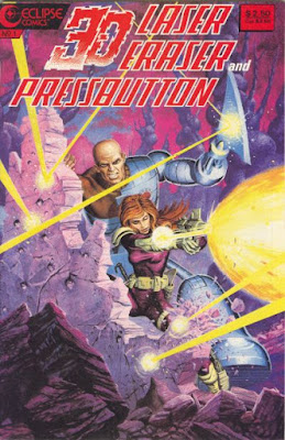
I have a soft spot for 3D comics. They're one of those moments of a venerable medium trying its hardest to become cool and cutting edge, but really only succeeding in looking like your grandad wearing converse and riding a skateboard. Most of the time it's just going to look ridiculous and completely fall apart.
There is the odd occasion, however, when grandad impresses you and makes it look like he's from Dogtown. I'm thinking specifically of the end of The League of Extraordinary Gentlemen: The Black Dossier, which is one of the most amazing uses of 3D printing tech I've ever seen (3D printing tech meaning printing 2D stories in 3D, not rendering them as plastic objects, obvs). Today's comic isn't quite that amazing, but the 3D adaptation of the stories is really quite good. I have to say that the place that I found it to be particularly effective was with the speech bubbles. They float in the panels at different focal lengths, giving the impression that some things are said before others (giving a third dimension to the McCloudian reading of speech bubbles), and that the words are, as they do in conversation, hanging there in the air, floating. It's a small thing, but really adds a nice texture to the comics themselves. Some bits of the actual graphics are handled quite nicely, though others are simply confusing or, at worst, headache-inducing. But I've definitely seen worse 3D effects than this little gem, so I'll leave the critique at that.
I like Laser Eraser and Pressbutton. They're badasses who do their own thing, have a murky, if generally good, moral code, and, though they're both bloody killers, really seem to have a good deal of affection for one another. I'm not always big on the retreaded UK comics that found homes in the smaller publishing companies of the 1980s (see my very first few reviews in this project of 2000 A.D.), but these ones are actually quite good. I grabbed this comic at the 2016 Calgary Expo, and it completed, as far as I know, my Pressbutton collection, so I'll get to their regular 2D adventures eventually. But til then, onward!
Mar 13, 2015
The 40 Years of Comics Project - Day 17: 30 Days of Night #1, June 2002

This comic, if memory serves, kick-started a horror comic renaissance in the early 2000s when it was published. Aside from the numerous sequels (and the film version) to this series, there was a renewed interest in comics with more atmospheric art styles than the previous decade. In some ways this hearkens back to the early days of Vertigo, when such talents as Richard Case or Ted McKeever were given the freedom to run rampant over comics with their distinctive styles, now affectionately known as "Vertigo-esque." And 30 Days of Night is eminently Vertigo-esque. Where, by the 2000s, Vertigo had moved firmly into its dark fantasy mode, IDW took some chances on people like Niles and Templesmith, and was publishing strange little comics that were unlike most mainstream fare. This is well before IDW became the go to publisher of licensed properties, and the success of their horror fare likely is what put them on the radar of franchises looking to branch out into comics, or, at the very least, that success is what gave them to economic heft to compete with others who were looking to publish licensed characters and stories.
But what about the comic itself? I think, of all the genres, horror has to be one of the most difficult to pull off in a graphic medium. Templesmith's art is remarkably evocative and atmospheric. The splash page on the second and third pages of the comic evoke that stifling darkness that comes with a twilight snow storm, and that burning eye of a sun that struggles through the clouds, that slowly sets, adds to the storm a feeling of the world ending. Which, narratively, is precisely what happens for a number of people in the town of Barlow, Alaska. There are moments where Templesmith's art verges into the abstract, especially when he's depicting brutal killings, and it is occasionally difficult to really figure out what's going on. Though perhaps, given that this is vampires killing people that they consider cattle, the abstraction is a mercy. And this is how horror can work in a graphic medium. I'll go on at length in a few years about the adaptations of Lovecraft into comics, and why the vast majority of them fail, but in short it's because atmosphere is sacrificed for detail. In the case of 30 Days, I don't necessarily need to see what's been done to the victims in order to know that something has been done to them. And chances are whatever I can imagine is worse than what would present itself in a less-abstract illustration.
(Though Ennis and Dillon's Preacher occasionally blows that theory out of the water.)
As for the story, the writing, Niles is a competent comics writer. The idea for the story is great, and the reactions of his characters to their increasingly horrific plight is believable and nuanced. I can't, off the top of my head, think of anything else he's written that I've read, but I look forward to seeing if his talents stretch beyond the horror genre.
Feb 26, 2015
The 40 Years of Comics Project - Day 2: 2000 A.D. Monthly v.2 #4, July 1986

Published by IPC Magazines Ltd.
Aaaannnddd....it turns out I do not have the whole series. So, somewhere between issue #1 and issue #4, Anderson is placed on suspension, and the Dark Judges are rampaging through Mega-City One. Easy enough to follow, really. There's some really terrible dialogue in the lead story, but the Dark Judges and Anderson are cool enough to overlook that little glitch. "Skizz" continues. If there's one thing to note about Moore's writing here, it's that his ability to mimic dialect in print is really pretty great. Or I'm assuming it is, never having been to Birmingham. "D.R. and Quinch" has vanished from the pages of the comic, which means their adventure on Planet Hollywood was a short one. It's replaced with an obscure Moore/Dillon sci-fi comedy called "Abelard Snazz" ("The Man with the Two-Storey Brain!"). It reads a lot like most of the 2000 A.D. one-offs: good art (it is Steve Dillon, after all), sort of trite writing. If you really want funny Moore, read Maxwell the Magic Cat (I'll get there eventually. Come back in a decade or so!). This is followed up by a piece that disproves what I've just written, the Moore/Gibbons (pre-Watchmen) short "Chrono-Cops," a clever little time travel paradox story.
Probably another week of 2000 A.D. in the pipe. This particular reprint series changed its name a few times. It's strange to me that a publisher would make that decision. The switch is small (from "Monthly" to "Presents"), and the series retains its numbering, but a lot of comics sales, especially in the pre-Comics Are Cool era of the 80s, was about branding. Changing one's brand seems a bad decision, especially this early in a comic's run.
See you tomorrow.
Subscribe to:
Posts (Atom)