Pages

Showing posts with label Charlton Comics. Show all posts

Jul 14, 2020

The 40 Years of Comics Project - Day 1967 - 1974

For information on stopping the spread of COVID-19, and on what to do if you are quarantined, have a look at the World Health Organization site.


 Ugh. Doing my best to stay on top of my project, but apparently not the blogging. Here's what I've been reading for the last week or so.

https://www.comics.org/issue/30156/

https://www.comics.org/series/72093/

https://www.comics.org/issue/1811859/

https://www.comics.org/issue/22061/

https://www.comics.org/issue/210284/

https://www.comics.org/issue/277986/

https://www.comics.org/issue/168615/

https://www.comics.org/issue/25958/

 Back to blogging regularly with a week of Latinx creators. I'll try to keep up with it, promise.

More to follow.

The 40 Years of Comics Project - Day 1966: Ghostly Tales #118, November 1975

For information on stopping the spread of COVID-19, and on what to do if you are quarantined, have a look at the World Health Organization site.
 
 
https://www.comics.org/issue/29171/
 
 
Okay, first things first. I chose this comic, amongst the other Charlton horror titles I've pulled, to read today because the character on the front reminds me of Squirrel Girl. Which is appropriate, given that the cover artist helped create her. Many times I'm interested in these old Charlton comics because they feature art from post-Marvel Steve Ditko. That said, his work in this really seems to be phoned in. A mediocre story with some mediocre art, sadly. But there's a silver lining: the issue features the work of Tony Williamsune. Mr. Williamsune is actually Tony Tallarico and Bill Fraccio, an art team who I am absolutely in love with. I illegally posted the story a few years back. I was moving about some books the other night and came across a Lynd Ward-illustrated edition of Frankenstein - I love the aesthetic of a lot of those old wood or lino cut works, and the Williamsune style, as I've said before, reminds me of these kinds of etchings.

I have been finding some of their other work in the collection, though the black and white stuff I've got, mostly in Warren Publishing reprints, isn't quite as enchanting. I don't spend nearly enough time considering the work of a colorist in comics, but I wonder if the reason I like this work so much is because of the choices the colorist made.

More to follow.

Jul 13, 2020

The 40 Years of Comics Project - Day 1965: The Many Ghosts of Dr. Graves #59, October 1976

For information on stopping the spread of COVID-19, and on what to do if you are quarantined, have a look at the World Health Organization site.


https://www.comics.org/issue/168829/


I recently pulled from the collection all of my Charlton "horror" titles. I put the term in quotation marks because these are obviously horror stories that are trying, as the little box in the top right of the cover suggests, to keep within the framework of the Comics Code. It's a pity, because without those restrictions, I think that some of these stories would be really creepy.

That said, the very best part of this comic is the cover by Rich Larson. There's definitely something of the Bernie Wrightson school of art here, one that continues with a artist like Kelley Jones into the 80s and 90s. It's got me thinking about the some time disparities between cover art and interior art, even when it comes from the same person. The purposes of the two kinds of comic art are very different. The cover is meant to draw us in, while the interior is meant to convey narrative once we're drawn in, puns intended. But often the interior will feature art that doesn't necessarily match, or live up to, the cover. Though Mike Zeck's work on the inside of the comic is excellent, it's the only one that comes near to the quality of the cover art. And this, for the most part, has nothing to do with the relative strengths of the artists. Mike Zeck, I'm sure, could have created a spectacular cover for this comic where he commissioned to do so. But the cover, and I say this as someone with very, very little strength when it comes to visual art, seems more like a portrait, more like fine art, than the narrative art within the comic. Only rarely, and often with great delay, do we see comics with spectacular cover art in which the interior art is of the same quality.  And even then, because the interior art's ostensible purpose is to convey story, the interior and cover art are always going to be of differing quality. Cover art wants to suggest to us a story that we will want to read. Interior art attempts to tell us that story, to meet our expectations, and, hopefully, to surprise us a bit.

Not sure where the blog's going over the next little while. I feel an overwhelming urge to keep posting works by BIPOC, but I also want to delve into some of the strange stuff I've got kicking about. And I'm thinking of reading as much of the old Marvel "Onslaught" crossover as I have. Been a while since I read a crossover. So we'll see. I'll probably try to mesh everything together. Seems to be my way of doing things.

More to follow.

Jun 10, 2020

The 40 Years of Comics Project - Day 1932: Ghost Manor #45, September 1979

For information on stopping the spread of COVID-19, and on what to do if you are quarantined, have a look at the World Health Organization site.
 
https://www.comics.org/issue/168598/

There's something so very intriguing about the Charlton Comics horror output from the 70s. While researching today's featured creator, the late Wayne Howard, I found an excellent articulation of this intriguing feeling from blogger Mark Andrew at Comics Should Be Good: "...since Charlton didn't want to do anything that'd offend your average 9-year-old, you can feel this book fighting against the uber-restrictive comics code." This is the sense that I get every time I read a Charlton horror title. The writers and artists want to be telling us much more interesting stories.

The other really interesting thing I came across, thanks to Mr. Howard's Wikipedia page, is that he was the first comics creator to receive the "Created by" credit in a comic for his work on Midnight Tales for Charlton. Such credits become common over the course of the 80s and 90s, but Mr. Howard was there first.

Much is made in a lot of the things I read about Mr. Howard's art style, some calling him the best of the Wally Wood school of artists, some calling him a really good imitator of Wood. I think they're really saying the same thing, but the language they're using really shifts meaning. I don't think there's anything wrong with coming from an artistic school - we see so many creators who are Kirby-inspired - where do we draw the line between practitioner of particular artistic techniques and wholesale copier? For the record, I think Howard's art is fantastic - it is dynamic while hanging onto a sense of menace that, as Mr. Andrew above notes, fights against the restrictive reigns of the Comics Code. The comic is really quite well done, for the genre of non-scary scary comic (?), and were I still an academic, I'd probably have something to say about the depictions of the Devil in this book and some of the similarities I see to the depiction of Satan in Milton's Paradise Lost. But I'm not still an academic, so never mind.

One last interesting thing to note is that Mr. Howard apparently did not want to talk about his work for Charlton, turning down an interview in 2001 with Comic Book Artist. I'm curious as to why this was the case, but that may simply be one of the great unsolved questions of comics.

More to follow.

Oct 23, 2018

The 40 Years of Comics Project - Day 1336: Beetle Bailey #106, July 1974

https://www.comics.org/issue/169294/

I needed something simple today. I mostly got it in Beetle Bailey.

If you're familiar with the strip, you know what it is - shenanigans on an army base. The characters are amusing, and it has something of the more slapstick side of M*A*S*H about it, though it's certainly lacking the social awareness.

Case in point, in one strip, Sarge thinks that the company is moving to Africa, so he starts buying beads and trinkets to take for the natives.

*sigh*

This comic came out the same year I was born. I'm always shocked at what things were like such a relatively short time ago. (No age jokes please!)

Not sure where we'll be heading tomorrow. Perhaps something completely different.

More to come...

Dec 16, 2017

The 40 Years of Comics Project - Day 1025: Ghost Manor #20, September 1974

https://www.comics.org/issue/168582/

(We'll start Christmas stuff tomorrow?)

There's a cool little booth at my local flea market called "Snobby's." Thankfully, the proprietor is anything but. I bought a large stack of coverless Archie comics from his a few months back and got some really amazing, really old, stuff that I likely wouldn't have had the chance to read otherwise. And the other day I picked up a "15 Comics for $5" pack at his place. Today's comic was one of the random things in there.

There were actually quite a few old Charlton horror comics, and I'm really looking forward to reading them. This one had some interesting stories, and sort of seemed to be a hybrid of horror and romance. The cover story, for example, is about a couple who purposefully get themselves bitten by a vampire to keep the woman, who is dying of...something, alive. And they get married at the end. And then the story about the man and woman who meet in the wake of a UFO crash ends with him, having known her all of about 6 hours, proposing to her. It's actually really odd. But perhaps that was the schtick for this title, that it was going to attempt to bridge the gap between male and female readership by offering something that, supposedly, appealed to both sexes.

I don't know. It was entertaining.

To be continued.

Feb 8, 2017

Giant Box of Comics Breaks the Law! - "A Solemn Oath!"

Came across the art of Tony Williamsune in this comic. Williamsune is actually two artists, Bill Fraccio and Tony Tallarico, and something about their style just captivated me. So I thought I'd share a bit of it. Copyright of course belongs to...well, to whoever owns Charlton's back catalogue now, I guess. If you want me to take it down, just let me know.

And if you're interested in some more of their art, there's another of their stories here, at Four-Color Shadows.


I'm not sure what it is that draws me to it. The very, very simple colour scheme is wonderfully evocative. And the almost equal amount of shadow makes it seem almost etched. Anyway, I think it's lovely.

The 40 Years of Comics Project - Day 714: Time For Love #38, September 1974

https://www.comics.org/issue/169541/

I read an issue of this series earlier last year and was thoroughly underwhelmed with it. The art was quite lovely, as is most of the art from 70s romance comics, but the stories were horrendous sexist programming that told young ladies they had to give up everything for their man, leap at the first marriage proposal that was offered, and always be really, really pretty.

Today's comic breaks from that slightly. The art is still excellent. And the characters all wear that CW level of prettiness. But there's a couple of stories in which the female lead wrestles with her feelings, rather than leaping straight into them, pondering whether or not what she feels is actually love or simply a brief infatuation. Which, I think, is a rather intelligent way of looking at relationships, occasionally. The best part of the comic, however, was the "Teen-Age Troubles" advice column, in which young women sent letters to Dr. Harold Gluck. There's a little more information about him here at the wonderful Sequential Crush. The young lady who wrote in was complaining of a weight problem that was keeping her from getting dates. Dr. Gluck's advice was rather excellent, as he stressed that before she plunged into some diet, she seek advice from a doctor. He even goes so far as to say that weight isn't necessarily a problem if one accepts one's own body. Forward thinking advice for the 70s, I think.

I think we need to see some contemporary romance comics, ones that tell a compelling story without devolving into stereotypical portrayals. Any artists out there want to collaborate with me? (I'm pretty sure "Stick Person Romance" would not be a success.)

To be continued!

Feb 5, 2017

The 40 Years of Comics Project - Day 711: Beetle Bailey #80, March 1971

https://www.comics.org/issue/169268/

In a very similar way to Archie comics, I find Beetle Bailey to be one of those relatively reliable comics. It's only very occasionally, if ever, going to be a revelatory experience to read, but most of the time it's funny, well rendered, and worth 20 - 30 minutes of your time. This was the reaction I had to today's comic.

Until I got to a text feature just before the final story, entitled "The UFF." I had a quick look through, and it turned out to be a small manifesto for the "Union of Fighting Forces," an attempt to unionize the American military. At first, understandably, I thought it was a joke. But it turns out that in the late 60s and early 70s, there were a number of people agitating for exactly this in the military. And why not, I suppose? It's a job, just like any other, so if those doing the job feel like they're being treated unfairly, of course they should unionize. It does seem to go directly against everything I know about how a military organization works, but that doesn't mean it can't work.

I found a few references to various attempts at this, and there was apparently an unrecognized (at least by the superiors) union in the army in the period this comic came out. They published their own newspaper, and were involved in some demonstrations for fair treatment of soldiers.

Who knew?

To be continued.

Apr 24, 2016

The 40 Years of Comics Project - Day 425: Last Kiss #2, August, 2001 ("Wuv, twue wuv" Week, Day 5)

http://www.comics.org/issue/545907/

You should go to John Lustig's "Last Kiss" site and read his comics.

I'll make an admission: I don't usually read text pieces in the comics I blog. I'll have a peep at "Stan's Soapbox" every now and again, or let my eyes wander over a letters page or two, but generally I'm more interested in the comics stories themselves. But with this comic, I thought maybe getting some context would be helpful. Let me explain.

Last Kiss is a romance comic, to be sure, but it's a romance comic with a twist (and that's a bit twisted!). John Lustig, apparently, bought the rights to a Charlton romance comic called First Kiss, and subsequently started re-scripting and manipulating them and making them into ironic 21st century parodies of the original pieces. This is not to say that he is not reverent of the source material - in some ways, in order to really skewer something, you have to love it a lot. This issue featured work by renowned inker Dick Giordano, even including an original piece scripted and drawn for this issue. The jewel in the crown that is this comic, though, is an interview with Giordano about his time working on romance comics for Charlton. He offers a rather wonderful articulation of the differences between drawing a superhero story and a romance story, and why, as an artist, he finds them interesting. I'd never really put together that there are different artistic vocabularies depending on the genre one is working in. Giordano notes that a romance comic is about subtlety and emotion, rather than action and hyperbole. It's one of those things that, of course, makes sense after the fact, but that I'd never thought of before.

So, much as the comics sections of this issue were funny, and I enjoyed them, the interview with Giordano was the best bit. Perhaps I'll have to start paying a bit more attention to text pieces in future.

Moving on, almost done our week of romance. Onward!

Apr 23, 2016

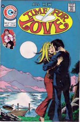
The 40 Years of Comics Project - Day 424: Time for Love #42, June 1975 ("Wuv, twue wuv" Week, Day 4)

http://www.comics.org/issue/169545/

Well, for a comic about one of the most powerful emotions humans feel, this was a thoroughly underwhelming piece. I'm beginning to see the differences between a good romance comic and a bad one, and the bad ones appear to end EVERY SINGLE STORY with the heroine getting a marriage proposal. In the 70s, it seems, one could not fall in love without it immediately becoming the greatest love of all time that will last forever.

Have you ever had one of those moments where you see right through the veil and understand the kind of programming that's been going on in culture for centuries? I had it with this comic. It teaches young girls everything that is completely wrong with society. Get a job as a secretary, have an affair with the boss, meet/fall in love/get married as quickly as humanly possible, because that's obviously the most fulfilling aspect of the female experience.

*sigh*

Okay, okay, think positive. There's some decent art in this issue. I have to admit that the fashions from the 70s are great, partially for their kitsch factor, and partially for their coolness. But the stories. Good grief.

On to something a little different tomorrow - a reprint series that removes the dialogue from old romance comics, and replaces it with more....ironic?....speech. Onward!

Apr 22, 2016

The 40 Years of Comics Project - Day 423: Haunted Love #2, June 1973 ("Wuv, twue wuv" Week, Day 3)

http://www.comics.org/issue/26271/

I don't know why I'm surprised to find such big-name creators working on a romance title from Charlton. I always forget that Charlton was a force to be reckoned with for some time in the late 70s and early 80s. I also have to work past that bias I have that superheroes are intrinsically the height of work for creators in comics. I know I would hate to do one thing for work for the rest of my life, so why should those involved in comics be any different? In fact, I can think of one or two contemporary professionals who should take a *cough cough Geoff Johns* break from superheroes for a bit, before one or both of them dies a horrendous death.

(Oops. Too late, DC Comics.)

Today's comic got me thinking about story lengths. There's two stories in this issue. The first, "Richard," is 8 pages long, and the second, "I'll Never Let You Go," is twice that. But "Richard" is a far superior tale. There's an odd juxtaposition of early 20th century-style clothing and seventies dialogue, but Staton's art is gorgeous, and Cuti's script is tightly-paced and plotted. (Also, Cuti produced a strange little underground comix series called Moonie that I am now hunting for, because it looks fucking bizarre.) There's even a rather lovely twist in the story in that the final teary love-revelation comes between two brothers, one deceased but still watching over his sibling, rather than the usual innocent waif and her hunky man. This offers a nice juxtaposition with the second story, though that's really the only interesting thing about it, in my opinion. "Never" is a cliched story of a woman whose bad-boy boyfriend dies in a car crash, and continues to haunt her even after she marries a nice guy (see that cover up there? That's literally all you need to know). The art is competent, but pales in comparison to Staton's work. Perhaps it would have been wiser to lead with this story so that the really stellar piece would end the comic. There's some nice use of flashback sequences, but, as with a number of the stories I've read over the last couple of days, the ending is just ridiculously rushed. The husband goes from not believing his wife to seeing and combating the ghost in the space of maybe 2 panels (and not two "a year passes" panels), and we're never given a good explanation as to why the ghost seemed to have been attracted to the house that eventually burns down (as they do), rather than the woman he was ostensibly haunting.

And so I wonder if the length of the piece allowed for too many extraneous details. Maybe we didn't need the flashbacks. Maybe this piece would have worked better as a short story, concentrating on the space and the setting and the situation, rather than the history, of the characters. Those other stories I mentioned above, with the rapid endings, are often ones of just this nature, regardless of the history of the characters we read about, and the stretch of time that becomes important in the tales is the one that comes "happily ever after" the end of the story. The effective romance stories, I'm finding, are the ones that tell the tale of the moment of love, rather than its history.

He said, having read probably less than 10 romance comics in his life. I guess we'll see over the next few days if my hypothesis is born out.

For those who might be interested, here's Nicola Cuti's Moonie at Comixjoint (which I've just discovered and it's amazing). More romance tomorrow. See you then.