Thoughts, reviews, rants, laments, and general chatting about the wonderful world(s) of comic books.
Feb 28, 2017
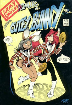
The 40 Years of Comics Project - Day 734: Army Surplus Komikz #2, 1983
The only other Joshua Quagmire comic I've read was the first issue of Critters, which I read some time last year. The Cutey Bunny story in that issue was dark, meditating on the destruction of Hiroshima and Nagasaki during the Second World War. Today's comic ventures into no such serious waters. Though published in the early 80s, Quagmire's comic retains the sensibilities of the older underground comix, rather than the brand of undergrounds typified by RAW that were appearing at the time. There's lots of bouncing breasts, sex jokes, and parodies of well-known and regarded public figures. The story is also comedically metatextual, in that Quagmire himself appears and is thrown out of a window before finishing the story. Perhaps this is why it makes little sense. My experience of underground comix has always been that, though. One of the wonderful things about this genre is that it is dedicated to pointing out to us that virtually nothing that we experience in life makes any sense - we make sense of it, but it doesn't make sense in and of itself. Maybe this is one of the skills, that of narrativizing, that reading imparts to us.
Maybe some more Cutey Bunny tomorrow. Or maybe not. You never can tell.
To be continued.
Feb 27, 2017
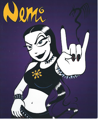
The 40 Years of Comics Project - Day 733: Nemi, 2007
Today's comic is one of those rare ones that doesn't have a GCD entry. It's a preview volume for a series of graphic novels to be published by Titan Books, collecting in English a popular Norwegian newspaper strip. Nemi is a cute goth girl who deals with life's odd little dilemmas. The nice thing about the strip is that goth is Nemi's look, and perhaps lifestyle, but that doesn't mean it inflects everything in her life. She has friends who are not goth, and likes guys who aren't necessarily a part of the subculture. In this way, it's a nice way of seeing the similarities between people of different subcultures and, by proxy, cultures.
The art is lovely and evocative, with the characters occasionally transcending into outright cartoonishness - though only when the situation deems it appropriate. And, as it's a European comic, it's not afraid to stray into topics that might be considered taboo in North American newspaper comics, such as not remembering who it is you've woken up next to in the morning. Honestly, Nemi is the sort of person I'd want as a friend, though is definitely the kind of person whose friends might be required to pick up the pieces of her life on a semi-regular basis.
Recommended, if you can track it down.
To be continued.
Feb 26, 2017
The 40 Years of Comics Project - Day 732: L.I.F.E. Brigade #1, 1986
This was a weird one. The cover had me thinking I was reading someone's comic from grade 4. Seriously, look at the face on that front character. But as I made my way through it, I began to think that the art is actually much more inspired by the underground comix of the 60s and 70s. There's something strangely subversive about it, which, sadly, the story doesn't quite pick up on.
This is the tale of a small group of adventurers, all outcasts, searching the cosmos for a new home for an increasingly needy humankind. But the interesting part is that by the end of the comic they've decided to return to Earth, only to find it devastated by a robotic alien race. So it seems that, rather than the sort of tired "Let's find a new place to live" storyline, we're getting the slightly more interesting "Holy shit what happened to our planet while we were away" storyline. The series lasts 3 issues, so we may never know what exactly happened to the Earth, but, if nothing else, the story is illustrated in really weird, and kind of wonderful, way.
What strikes me is that that cover is not at all indicative of the richness of the interior art, so I wonder if it's a style of art that doesn't suit the colouring on the cover. Had that been a B&W cover, it might have conveyed a much more mature aesthetic than it does. Perhaps there are artistic styles in comics that just don't suit colouration.
Onward!
Feb 25, 2017
The 40 Years of Comics Project - Day 731: Giggle Comics #38, February 1947
And so it begins!
(I taught my class about hyperbole the other day. But in the case of kicking off the third year of my project, it seems mildly appropriate.)
A less than auspicious start to Year 3 of the 40 Years of Comics Project. While Giggle Comics#38 is by far the oldest comic in the collection, it is also, bar none, the most racist comic I have ever read. The sole human protagonist of the first story, "Superkatt," is a prime example of the "Mammy" stereotype of African-American women that pervaded popular culture at the time. It is a very difficult visual depiction to look at page after page. One positive that we might draw from this depiction, though, is the laying down of dialogue in dialect. With the recognition of African American Vernacular English as a dialect of the English language common in the United States, the "Superkatt" story can actually serve as a comics-related record of the way that dialect was considered in the mid-Twentieth century.
I'm looking for the silver linings here. Can you tell?
There are some intervening stories that are harmless. A ghost and his house owner set up an spiritual entertainment show, with ghosts performing tricks rather than scaring people. A wolf and a rabbit solve silly crimes. It's all very funny animal/friendly ghost kind of shenanigans, almost enough to make you forget the difficulty of the first story.
Until, of course, we get to the last one. If the depiction of African-American people in the first story is mildly recuperable from a linguistic stance, the final story, "Northern Nonsense," has no such saving grace. The tale of an Inuit father teaching his son to paddle a canoe, this is simply a blatantly stereotyped comedy, laughing at the practices and appearances of Northern Native Canadians. Really, just awful.
But I suppose this is something that we, as comics scholars and fans, have to accept about our beloved medium: It's a product of popular culture, and sometimes (or rather, many times), popular culture is a less-than-savoury reflection of the society at large. The best we can do with such works as Giggle Comics is look to see how far we've come, and recognize how far we have to go.
Welcome, then, to Year 3. To be continued.
Feb 24, 2017
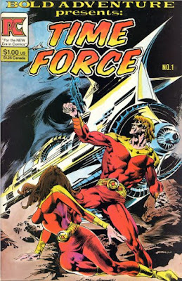
The 40 Years of Comics Project - Day 730: Bold Adventure #1, November 1983
And so Year 2 comes to a close! It's been an interesting year. I've read some really great comics, and a few really, really terrible ones. Re-reading Morrison's Batman was a lovely treat, and I really can't wait to see what I get up to over the next 365 days.
Today's comic is a bit of nostalgia for me, even though it was one of the comics that was part of my quarter bin buy a few weeks ago. I first came across Bold Adventure #1 (though I mistook the title for "Time Force") back in the earliest days of my collecting. When I first got into comics, my parents went out and bought me a comic collecting kit. It included a box, which was somewhere between standard short and long box size, a price guide, and a package of 20 or so comics. I can't for the life of me remember what most of them were, though it seems to me they were generally from indie publishers from the 80s. I do, however, remember this comic, and if I'm to be honest, it was probably because my pre-pubescent brain was fascinated by the very prominent breasts on the cover. I wish I could say I've changed...
The stories inside are pretty neat, all penned by Bill DuBay. There's a bit of science fiction, a bit of adventure, and what is potentially a horror tale in the final short piece entitled "The Weirdling." I was a little confused by the "Time Force" story, as it ends quite suddenly with the death of the main character and the triumph of the bad guy, and with no "to be continued." At first I thought it was quite a gutsy move, to give so much set up and then have all the hope one invests come to naught. But it turns out the story does continue in the next issue, so perhaps all hope is not lost. Perhaps.
Tomorrow begins Year 3. I'll be reading the oldest comic in my collection as a way of kicking off the year, and then I've got a bit of a theme planned for the first couple of weeks. I hope you've enjoyed Year 2, or some of it anyway. I know I have.
To be continued.
Feb 23, 2017
The 40 Years of Comics Project - Day 729: The Puma Blues #22, 1989
This is a very cool comic. There's a definite impetus of resistance going on in it, very much focussed on the environment, and given that it's a 27 year old comic, some of the ideas and subjects brought up in it are really very contemporary. The back matter includes political cartoons about the denial of climate change, zine ads about resistant action, and a call from Amnesty International to abolish a death penalty that is used primarily against the most vulnerable members of society. It is an unabashedly, vocally resistant comic.
And as if that wasn't awesome enough, it features stunning (and I mean absolutely stunning) artwork by Michael Zulli. His nature scenes are on par with Masashi Tanaka's amazing work on Gon, though skewing more to the ruggedness of the American landscape, rather than Tanaka's often lush jungle and forest settings. Let's be honest: anything Michael Zulli does is going to be pretty breathtaking, but I think this might be one of my favourite things I've seen by him.
And still there's more: The Puma Blues, this issue at least, falls into a very small category of comics I've read, one that includes such strange works as Martin Vaugh-James' The Cage and Rick Veitch's Can't Get No, comics that move fairly explicitly into the realm of the poetic rather than the prosaic. There's a link between words and images, but it often veers off into the metaphoric rather than the literal, forcing a much closer and slower reading experience. Such works can be frustrating (I have, indeed, heard much hatred for The Cage), but ultimately, if one gives them the time to work both independently and concurrently on the verbal and visual, one is gifted with a rather fantastic experience of metaphoric language through the lens of comics.
I was going to add The Puma Blues to my list of comics to track down until I found out that the series was never completed as periodicals. However, Dover Publishing, that champion of cheap editions of great works of literature, has a graphic novel of the series that includes a new 40-page chapter that finishes the series. I think that'll have to go on my list of stuff to get.
Tomorrow is the end of Year 2. Time flies when you're....well, this year hasn't actually been very fun, but at least I've gotten to read a comic every single day.
To be continued.
The 40 Years of Comics Project - The Weekly Graphic Novel: Week 35 - Flesh & Metal v.1, 2004
Beyond the break, machines and humans explore the future of sex.
Feb 22, 2017
The 40 Years of Comics Project - Day 728: The Little Monsters #33, April 1976
A couple of years ago I taught Mary Shelley's Frankenstein to one of my classes. In one of the lectures, I gave them examples of how Shelley's Monster has become a staple of our popular culture. It's a pity I didn't have this comic at the time.
That said, there's some weird problems with this comic. First is the really horrendous forced puns. "You're so terror-bly thoughtful." "Bad-bye." I mean, I get it, and very likely the demographic this comic is aimed at would love it, but I'm certainly not that demographic.
The second thing is a little more serious. It seems like the entire monster family lives in perpetual fear of their grumpy father. And not just grumpy. When he's angry, he kicks the kids around and yells, and they all dive for cover to avoid his tantrums. Again, I kind of see where this comes from, in that he's a proxy for Frankenstein's Monster, but there's something downright chilling about the reactions of his family toward his anger, and his reactions toward them. It's behaviour I can't see being accepted as comedy in a contemporary comic. Which, I suppose, is one of the most interesting things about this project I'm pursuing. As popular culture artefacts, comics tend to reflect quite explicitly what was going on in the culture at the time of their creation. You simply have to look at the push toward representation in today's comics to see that clearly. So each time I come across something culturally bizarre in a comic, I'm reminded of how quickly, and sometimes how slowly, culture changes. I can only imagine, 20 or 30 years from now, what the comics of today will look like.
To be continued.
Feb 21, 2017
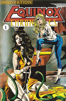
The 40 Years of Comics Project - Day 727: Equinox Chronicles #1, Spring 1991
An interesting read. It begins as a techno-thriller of sorts, but then quickly changes into a sort-of superhero book. Sometimes it's a bit off-putting to have a comic switch gears so quickly, but sometimes it's good to have something keep you on your toes.
Unfortunately the company/artists decided that they needed to go with the sex sells philosophy for their front cover. While there is a kidnapping performed by the eyepatch-wearing Vypira, the kidnappee's dress doesn't quite get shredded the way it is on the cover. In fact, though the art within and without is by the same person, Mark Jones, the two bear very little resemblance to one another. This makes sense, in that a cover is a more stylized representation of the events within (most of the time), but the distinctiveness of the difference really highlights the influence an inker can have on the look of a book.
Storywise, this was an okay tale. The series only runs two issues, so there really seems to be a lot of set-up for a very limited amount of narrative space. I suppose, in many cases, it's the hope of the creators that the comic will take off and they'll be able to tell longer, more complex stories. But I've always found the notion of assuming that you'll be able to very strange. Why not start off with smaller stories, and then if you're successful, start telling the long ones? That said, every series of comics scripts I've ever written have been multi-part epics, so maybe it's just how comics fans think.
To be continued.
Feb 20, 2017
The 40 Years of Comics Project - Day 726: Police Action #1, February 1975
I'm not a huge fan of crime comics. There's particular subject matters that I have a hard time trying to be entertained by. It's for this reason that I've never watched The Godfather, or any of the numerous and critically-acclaimed war films that have been made over the years. I can't wrap my head around being entertained by crime or war. I can do it through the more stylized lenses of science fiction, fantasy, or horror, but when it comes to more realistic portrayals, I just don't get the allure.
Crime is brutal and violent, as is war. And though I know it's a, sadly, fundamental part of our current societal make-up, it's certainly not something I want to dwell on any more than I already do (which is quite a lot, unfortunately). So how do I reconcile entertainment/recreation time spent considering, even fictionally, the brutality of human beings?
Generally, I don't. Today's comic was interesting, and I'm sure I'll get to more crime comics as the project continues. I'm a fan of Mike Ploog's art, so the second story featuring Luke Malone was a nice treat. I kind of love that there's this four-colour noir thing going on in this book. I even found the mysteries in the stories intriguing, which is always a nice change. Many comics I've read over the last little while have turned out to be too predictable. Perhaps that's a generic thing? The simpler, more stylized realities of superheroes and fantasy warriors is far more predictable than the grimmer reality of the private detective. Though likely the truth is that they're predictable in their own ways, but those ways are distinct from one another. Food for thought.
To be continued.
Feb 19, 2017
The 40 Years of Comics Project - Day 725: Terraformers #1, April 1987
There are two really interesting things going on in this comic.
First, this has got to be pretty early Kelley Jones art, probably done some time while he was toiling away on Micronauts. It's not quite as polished as I'm used to seeing him, which could have to do with the inker he's working with. Jones, to me, has much more shadow on his figures. But it's cool to see art from an artist relatively early in their career, especially one as distinctive and impressive as Jones. If you're never had a chance to look at his work on the Batman books, on The Crusades, or in The Sandman, do yourself a favour.
The other interesting thing is that this is a Mecha comic. It's about teams of people piloting giant terraforming robots. The human/machine interface is basically identical to the one in Pacific Rim, and the premise seems to be coming straight from Japan. However, if anything, it's the least manga/anime-inspired giant robot story I've ever seen. From the robot design to the cast of characters (who spend much of this issue, when not piloting the robots, preparing to go on strike), to Jones' style of art. Perhaps it's that, that there's almost no influence of manga on the art. Even when we come to such Western comics styled series as Tokyo Storm Warning, particular tropes from the manga inspirations seeps in. But not so with Terraformers. It's a Western Mecha comic, and as such, is pretty neat.
To be continued.
Feb 18, 2017
The 40 Years of Comics Project - Day 724: Darkewood #3, 1988
I am of two minds about this comic.
First, it's so very clearly an adaptation of a D&D, or other fantasy RPG, adventure, which makes me love it. One of the main characters is a swashbuckling bard, and as someone who plays a bard currently in a game, it spoke to me in a lovely way. Second, there's a point in which the protagonists are confronted by a group of trolls, and it was awesome to see that both male and female antagonists were dressed just as skimpily as one another. I thought perhaps it was a relatively egalitarian comic, with regard to clothing/armour.
Until I got to the end of the comic and realized that every female character we encounter is basically wearing a bikini. And, aside from a few trolls, every male character is fully-clothed.
*sigh*
To be continued.
Feb 17, 2017
The 40 Years of Comics Project Friday Magazine 2 - Doctor Who Classic Comics #1, December 1992
Doctor Who comics, in the weekly iteration of the magazine, were amongst the earliest comics I ever read. I like to boast that this means I was reading Alan Moore comics almost as soon as I could read, which, if you've ever met me, explains a good deal about the person I am, I think. But the comics I cut my teeth on certainly weren't the first comics based on the venerable science fiction series. As the editorial in this magazine notes, "it was less than a year after the series's...debut on television" that a comic strip started running in the appropriately named TV Comic magazine.
I only have three issues of this series, but I'm glad to have a chance to read some of the older Doctors' tales in comics. Aside from the annoying habit of actually referring to The Doctor as "Doctor Who," the stories contained herein are pretty cool little pieces that capture the flavour of the television series quite nicely. The longest of the stories, "Timebenders," deals with a Nazi teleportation experiment that accidentally pulls the Doctor back to the Second World War, where he has to stop the Third Reich from gaining time travel tech. Classic Doctor Who.
One of the other features in the comic is one of my favourite bits of Doctor Who comics, "The Daleks." The Doctor's nemeses get their own story told, from their beginnings as organic beings to their eventual attempts at universal conquest. The Daleks may look slightly silly, but when they're handled well, they're terrifying. These comics, published in the 60s originally, were also reprinted in the main DW magazine, and I always looked forward to the next installment of a series where I could, much of the time, root for the baddest of bad guys. I don't know if it's ever been collected, but if not, it should be.
Onward!
The 40 Years of Comics Project - Day 723: Domino Chance: Roach Extraordinaire #1, 1987
When you make a list of all of the animals that could be anthropomorphized and made into science fiction action heroes, do cockroaches even come close to making the cut? For Kevin Lenagh, they do. Domino Chance, as far as I can tell, picks up from an already ongoing story, despite being the first issue of a three issue series (only one of which was published, I think).
(Ah, the woes of indie publishing.)
There's a lot of reference to Dune, a good deal of Star Wars influence, and a strange religion founded by an ad-man named Chuck. That aside, even taking into account an awkward prologue/exposition, it's hard to say what was going on in this comic, who knew who, and where the series was heading. What I will say is that Lenagh meshes superhero-style humans and funny animal-style bugs and aliens seamlessly, which is no small feat. Though the mixture may not look natural to us, Mr. Lenagh makes it feel natural, which helps immeasurably with both making the setting believably alien and also making it familiar enough (in the interactions of characters) that we're not completely alienated from it.
If that made any sense at all!
To be continued.
Feb 16, 2017
The 40 Years of Comics Project - Day 722: Angel Fire #3, October 1997
Something that I had never really thought about before I started reading from this box of oddball comics is that there are really a lot of comics in the Grand Comics Database that are represented simply by their covers. Today's comic, for example, has no other information, outside of the most bare bones technical stuff. It is a testament, I suppose, to the enormous volume of comics out there that not all of them get the loving treatment of the big books from the big companies. I had, at one point, decided that each time I came across such an undocumented comic, I would fill in all the information I could. But it's a time-consuming process, and one for which I simply do not have the time.
I really wanted to like this comic because it's written by Dan Mishkin, who wrote some of the Advanced Dungeons & Dragons comics that I dearly love and that I read very early on in this project when I thought I'd be able to go through my collection alphabetically. But, whether because it's the third issue of a three-issue series, or because it's a fairly generic kind of spy/action/pseudo-superhero story, I just didn't dig it. The art is not quite my cup of tea and the story seems like it's been told before. Numerous times, in fact.
This is not to say it's not a well-wrought comic. It's simply not to my taste.
To be continued.
The 40 Years of Comics Project - The Weekly Graphic Novel: Week 34 - Ada Lee v.1, 2001
More erotic graphic novel goodness after the break (that is, if I'm working these widgets right!)
Feb 15, 2017
Giant Box of Television: Arrow Season 1
I was recently inspired to go back and watch Arrow from beginning to...well, not quite end, but to where it's up to now. I didn't get on board with Arrow right away as I was quite annoyed by the idea that they were going to attempt a superhero television show without superheroes. There had been a clear communication from the creators of the show that this was not going to involve all of the things that make a superhero universe wonderful and weird, but rather would be an action show about a guy with a bow.
Thank goodness they got over that.
Once Flash had started on the CW, and I loved it, I decided I should probably familiarize myself with the characters from Arrow who were popping up every now and again. I'm very glad I did, for many reasons, not least of which is that Stephen "Oliver Queen" Amell is seriously one of the most attractive people on television.
Season 1 of the series is dark. Very, very dark. But it manages to balance that darkness with some deeply human moments, and some very funny moments. Oliver, at this point, has just returned from what the intro to the show calls "5 years in Hell," the end of which we're just now seeing in the current season. It's probably not a stretch to consider this entire season to be a depiction of a man dealing with PTSD in a very extreme way, but one that channels his demons and pain into something better. It also wonderfully sets up a good deal of the moral greyness that follows the character throughout the series, as even now, in the 5th season, the characters are still dealing with the ramifications of Oliver's indiscriminate killing during his first year back in Starling City.
Green Arrow has never been one of my favourite comic characters. Much like Daredevil, I always saw him as a sort of Batman-lite, and in many ways he's treated that way in this series. In fact, some storylines are lifted directly from Batman's corpus (season 3's conflict with R'as al Ghul, for example), and it's easy to watch the show from the perspective of it really being a Batman show. But Oliver Queen has some very different personality traits to Bruce Wayne. Particularly, in this season, we see his deep loyalty to his family, and his eventual acceding to the opinions of others in his mission. His supporting cast grows and develops over the course of the season too, going from background figures in the series to fully-fleshed out individuals all their own. It strikes me that the creators of the series probably initially envisioned it as simply a Batman story but with a green costume, but the characters surround "The Hood," including Starling City, changed it into something else.
Unlike their filmic counterparts, the Arrowverse television shows understand that superhero comics can vacillate from light to dark literally in the space of a panel. There are still cheesy one-liners, sometimes completely out of place, but that's what a superhero universe is. It's simpler than our own. And vastly more complex (fans of DC's pre-Crisis continuity know what I'm talking about). But it's never one or the other, and Arrow does a wonderful job of representing that.
Labels:
Arrow,
Arrowverse,
Batman,
criticism,
Green Arrow,
links,
review,
television
The 40 Years of Comics Project - Day 721: Dragonring #1, 1986
There isn't a lot of writing online about Barry Blair and Aircel Publishing. I keep seeing vague references to criticisms of Blair's art, based on his predilection for illustrating characters as quite young and androgynous, and then putting them into sexual situations. I can see it in the few Aircel comics I've read by him, and it brings up the notion of the sexuality versus the sexualization of underage people. It's certainly not something I want (or feel qualified) to get into here, but it's worth noting the difference between those two things. Many kids grow up feeling embarrassed by sex, and feeling thoroughly put off by what happens to them during puberty and adolescence. Were we to educate more fully about facets of sexuality during their formative years, these sorts of things might not be quite as awkward. On the other side, sexualizing children (that is, layering one's own sexual desire on an underage person) is not okay. Did I really have to say that? But that leaves us with wondering where Blair lands on that spectrum. As I noted, I haven't read a lot of his work, but perhaps as I see more of it, I'll be able to make clearer conclusions. Hopefully they'll not be gross.
Dragonring is intriguing. As I've been making my way through this quarter bin collection, I've found a few gems that I think I may pursue. Dragonring is one of them. Guang Yap's creatures are Lovecraftian in the extreme, and the pulp adventure style of the story (complete with kid sidekick and bumbling comic relief) is quite good. The GCD tells me that, over 2 volumes, there's 18 issues, which gives the story ample time to develop. And, hopefully, I'll be able to find them for every bit as cheap as I found this one.
A man is hired to transport someone to an island that that person has just inherited. There's a weird temple, filled with odd characters, and there's monsters underneath it. And it's set in China. Couldn't really get more pulp if it tried.
To be continued.
Feb 14, 2017
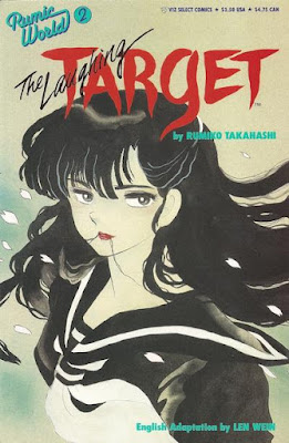
The 40 Years of Comics Project - Day 720: Rumic World #2, 1990
You know what I like? A good, spooky manga. There's something gently terrifying about a well done Japanese ghost story, and today's comic is such a story. Apparently Rumiko Takahashi is best known for InuYasha, which I've heard of, but never read, but she's also known for her short story manga work. In the early 90s, Viz published two of her stories under the Rumic World title, though it appears to have not lasted very long. I read part of her longer creepy story Mermaid Saga a little while ago, and mentioned that it reminded me very much of MuShiShi, in that the ghosts and strangeness of the stories are accepted as being simply phenomena that happen, and that there are people whose job it is to handle such things. Even the more comedic Ghosttalker's Daydream graphic novels have this feel (though mixed in with a healthy dose of bondage and domination). It's an attitude toward the supernatural that we really only see in Western culture in our religions. Only there do we accept the spiritual as simply a fact of life. Ghosts and spirits, though, not so much.
I will be looking out for more of Ms. Takahashi's scary little stories. They really are excellent. And if you're interested, here's a link to the first part of an OVA that was made of this story.
To be continued.
Feb 13, 2017
The 40 Years of Comics Project - Day 719: Porky Pig #2, May 1965
Who the heck is Cicero Pig? He's apparently Porky's roommate, but, later on in this comic, they share a bed at their new house. It's interesting to me that I make the assumption that everything I've seen on television as far as the Looney Tunes characters go is all that there is to them. That would be like someone doing the same for the Marvel Cinematic Universe, I suppose. The comics world of such characters as Bugs Bunny, Daffy Duck, and today's star Porky, are just as vast and varied, if not as continuity-bound, as any other transmedial universe. I balk occasionally at reading, or buying, these old cartoon-based comics. For some reason I assume that they're going to be simple and boring for an adult reader, which is a totally unfair judgment for me to lay on them. The writers of these comics might have been trying to appeal to a particular demographic, but they were still adults writing stories that, hopefully, kept them entertained. Perhaps I have to delve into my Gold Key kids comics a bit more in the next year of the project.
There's an excellent wrap-up of Cicero's career here, offering the unfortunate information that at different times, he's been both Porky's nephew and Petunia's cousin. Um.
To be continued.
Feb 12, 2017
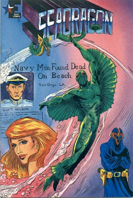
The 40 Years of Comics Project - Day 718: Seadragon #5, September 1986
I'm going to be honest: I started reading this comic yesterday, put it down, and forgot to get back to it. Hence, the Lady Death in Lingerie appearance yesterday. It was one of my contingency comics that I keep handy just in case I don't have time to read a comic on a particular day. It does happen occasionally.
So what we have here is a kind of cool idea, though I have to wonder about the almost disco design aesthetic. A Navy diver gets sealed in an experimental wetsuit by an explosion of radioactive waste. You know, when you write it out like that, it sounds every bit as ridiculous as it actually is. But it's a superhero comic, so of course it's ridiculous. The only problem with this kind of premise is that you make it remarkably difficult to have the character interact with anyone. He can't have a secret identity, and he's bright green and has fins. I'm not saying it's impossible to have "normal" interactions, but it makes life much more difficult for a writer. That said, the series ends in the next issue, so maybe he manages to get out of the suit. Though I've just realized that there's a solicitation for issue 7 in the back of this comic.
Grant Morrison proposed, in Animal Man, a limbo dimension where all the forgotten characters go and basically do nothing. I feel like all of these indie superheroes from the 80s who just disappeared are sitting around, playing cards, wondering what would have happened to them had their stories continued, and possibly being glad they didn't, considering what happens to superheroes these days. I mean, if you're sitting in Limbo and you see Batman's life unfolding, I think you'd probably be glad that you were stuck somewhere where crazy shit like that doesn't happen.
Maybe that's the comic I need to write.
To be continued.
Feb 11, 2017
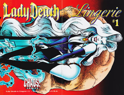
The 40 Years of Comics Project - Day 717: Lady Death in Lingerie, August 1995
It's a whole comic of Lady Death in various "interpretations" of the term lingerie.
That's it.
Some of the pictures are good. There's some interesting interpretations of the character. But no story.
Instead, then, I'll offer a picture or two to show what this comic's all about:
By Mitch Byrd.
By Ben Dunn.
By Joe Linsner.
By David Mack.
Onward!
Feb 10, 2017
The 40 Years of Comics Project - Day 716: Priority: White Heat #1, 1986
So, apparently even international spies need to have boob window costumes?
I don't know much about AC Comics, but I do have one or two of their publications in my collection. The art in this issue is pretty good. There's even a single page that highlights some fashion designs by artist Secrease, so it's definitely got that aesthetic sensibility going for it. Unfortunately the story doesn't really stand up. The text box at the top of the first page claims that our protagonist is "part Bond," which does come across in the whirlwind tour around the world that White Heat undertakes to track down a Nazi defector. Oh, yeah, it's the Nazis. Again.
(You know, stories with Nazis as antagonists seemed far more far-fetched about a year ago. Funny how the world changes, innit?)
The problem with the story lies in the dialogue and the attempts, in caption, at gritty crime noir-esque exposition. No only is it not pulled off to well, but the comic is rife with grammar and spelling problems. I know that this critique comes from my years as a teacher, but, really, spelling and grammar are the most basic foundation, after the alphabet, of written communication. If you can't be bothered paying attention to it, how can you possibly call yourself a writer?
(Big can of worms there. I'll just leave it.)
Anyway, not much else happens aside from the heroine travelling around the world, looking for Nazis. They turn out to be, as they often do, in South America, and the issue ends with White Heat piloting a Harrier jump jet into the wilds of Brazil. As one does.
To be continued.
The 40 Years of Comics Project Friday Magazine 1 - Eerie #31, January 1971
I have in the collection a rather large number of comics magazines, ranging from children's superhero stuff to a huge sub-collection of Heavy Metal magazine. I don't think, in most cases, I would have the time to read the whole magazine in one day. They are, by and large, longer than a traditional comic, and, in the case of the more adult-oriented publications, somewhat more complex. Bearing all this in mind, I'm going to start trying to do one a week, much like my graphic novels, and I'll be posting them on Fridays, along with my usual comic.
Today's magazine was selected on the basis of it containing a story pencilled and inked by Tony Williamsune, a gestalt entity made up of Bill Fraccio and Tony Tallarico. I came across some of their art in romance comic I picked up recently, and their style struck me immediately. Apparently the two worked closely for Warren in their horror magazines and for Charlton in just about all their genres. So far, unfortunately, none of the stories of theirs that I've found in my collection has measured up to that one romance story, though the story in this issue ("The Drop") does contain a bit of their weird, psychedelic strangeness.
This might well be the first Warren horror magazine I've ever read cover to cover. They simply weren't on my radar when I was first collecting comics, and I only have these as they were part and parcel of the collection I bought that included the aforementioned Heavy Metals. The stories were pretty good, for the most part, especially the lead tale, "Point of View," from which the Richard Corben cover is drawn. There was a kind of confusing metafictional tale called "The Alien Plague" that either didn't make sense, or didn't make sense to my tired mind when I read it. But I am looking forward to delving into the magazines I have. I've had them for less time, so they're less familiar to me than the comics in the collection. Can't wait to see what I find!
Onward!
Feb 9, 2017
The 40 Years of Comics Project - Day 715: Hot Stuff, The Little Devil #115, March 1973
I don't really have much to say about this one. Hot Stuff, and his pal Casper, have never really resonated with me. Much like their comrade Richie Rich, these characters inhabit a very strange, decidedly surreal world. There are countries that bear no resemblance whatsoever to our own world, and a plethora of weird and wonderful creatures that everyone seems to take completely in stride. Hot Stuff visits a land where there's bizarre weather that changes on an almost minutely basis (it's called Calgary), yet no one reacts to the fact that he's literally a tiny devil. They just talk to him like that's a thing that happens.
I think that Harvey comics is probably one of the most underrepresented publishers in my collection. I like Richie Rich well enough when I was young, though I definitely skewed more to Archie. And I was raised on Doctor Who comics, so the children's stuff that Harvey, or Dell, produced just never seemed to draw me in. I'll get to it eventually, as I will with all things in the collection, but it just doesn't really call to me.
To be continued.
The 40 Years of Comics Project - The Weekly Graphic Novel: Week 33 - Swarm v.2, 2006
The triumphant return of the weekly graphic novel, after a short hiatus. I was fortunate enough to get a couple of magazine boxes full of erotic graphic novels a few weeks back, so I'll be drawing my weekly GN reads from those for the next couple of months. You've been warned!
Feb 8, 2017
Giant Box of Comics Breaks the Law! - "A Solemn Oath!"
Came across the art of Tony Williamsune in this comic. Williamsune is actually two artists, Bill Fraccio and Tony Tallarico, and something about their style just captivated me. So I thought I'd share a bit of it. Copyright of course belongs to...well, to whoever owns Charlton's back catalogue now, I guess. If you want me to take it down, just let me know.
And if you're interested in some more of their art, there's another of their stories here, at Four-Color Shadows.
And if you're interested in some more of their art, there's another of their stories here, at Four-Color Shadows.
I'm not sure what it is that draws me to it. The very, very simple colour scheme is wonderfully evocative. And the almost equal amount of shadow makes it seem almost etched. Anyway, I think it's lovely.
The 40 Years of Comics Project - Day 714: Time For Love #38, September 1974
I read an issue of this series earlier last year and was thoroughly underwhelmed with it. The art was quite lovely, as is most of the art from 70s romance comics, but the stories were horrendous sexist programming that told young ladies they had to give up everything for their man, leap at the first marriage proposal that was offered, and always be really, really pretty.
Today's comic breaks from that slightly. The art is still excellent. And the characters all wear that CW level of prettiness. But there's a couple of stories in which the female lead wrestles with her feelings, rather than leaping straight into them, pondering whether or not what she feels is actually love or simply a brief infatuation. Which, I think, is a rather intelligent way of looking at relationships, occasionally. The best part of the comic, however, was the "Teen-Age Troubles" advice column, in which young women sent letters to Dr. Harold Gluck. There's a little more information about him here at the wonderful Sequential Crush. The young lady who wrote in was complaining of a weight problem that was keeping her from getting dates. Dr. Gluck's advice was rather excellent, as he stressed that before she plunged into some diet, she seek advice from a doctor. He even goes so far as to say that weight isn't necessarily a problem if one accepts one's own body. Forward thinking advice for the 70s, I think.
I think we need to see some contemporary romance comics, ones that tell a compelling story without devolving into stereotypical portrayals. Any artists out there want to collaborate with me? (I'm pretty sure "Stick Person Romance" would not be a success.)
To be continued!
Feb 7, 2017
The 40 Years of Comics Project - Day 713: Dark Adventures #4, September 1987
The life of a public domain superhero is a strange one. Bob Benton, aka The Black Terror, has been around since 1941, fighting Nazis, Communists, and supervillains. He's been resurrected in recent years by the likes of Alex Ross and Alan Moore, as well as having had a fairly prosperous career in the mid-80s during the black and white indie golden age. Today's comic is one of those, and the only appearance, as far as I can tell, of this particular revival of the character. The art in the comic is quite well-rendered, though it varies from page to page. There's a particular spread in the middle that actually looks like it might have been reproduced from a rough layout of what was supposed to be there, or from uninked pencils, but aside from that it looks pretty much like a superhero comic. A strange thing for someone like me to say, I guess, but true nonetheless. The script is so-so, a little awkward and stilted, though the framing sequence is quite lovely. The Terror Knight's old partner, now confined to a wheelchair and quite old, is telling the story of the Terror Knight's revival to someone over the phone. Only at the end of the story do we find out it's a speaking clock he's talking to. He just needs to tell someone about the madness that is his life, a madness he can't escape.
I looked up the history of the Black Terror, and he's gone through a vast number of publishers over the last 70 years. Undoubtedly, we'll see yet another version rear up in the near future.
To be continued.
Feb 6, 2017
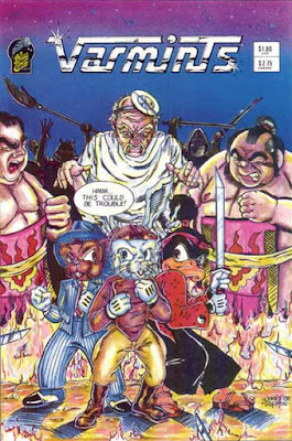
The 40 Years of Comics Project - Day 712: Varmints #1, 1987
A funny animal comic that was, unfortunately, not that funny. There were attempts.
The art in this comic is quite good, and there's an editorial on the inside front cover in which Craig Storman, who seems to be the mastermind behind Blue Comet Comics, talks of adopting a more realistic art style. I have the first issue of his other comic L.I.F.E. Brigade set to go as a contingency posting, and the art in that comic is far more underground than in this comic. Though at the end of the issue we get the prologue to the tale that comes first in the comic (?!), which was supposed to be a back-up feature in L.I.F.E. Brigade. Why it wasn't printed at the beginning of the story, I have no idea. It could be that this prologue is in the older art style, and is quite different.
I don't know why I try to make sense of indie comics, sometimes.
The other story in this issue, "Ace Phillips, P.I.," is a story of a detective who is an anthropomorphic Hippo. I don't know when Hip Flask was created for Comicraft lettering ads, but he's definitely got a predecessor here.
To be continued.
Feb 5, 2017
The 40 Years of Comics Project - Day 711: Beetle Bailey #80, March 1971
In a very similar way to Archie comics, I find Beetle Bailey to be one of those relatively reliable comics. It's only very occasionally, if ever, going to be a revelatory experience to read, but most of the time it's funny, well rendered, and worth 20 - 30 minutes of your time. This was the reaction I had to today's comic.
Until I got to a text feature just before the final story, entitled "The UFF." I had a quick look through, and it turned out to be a small manifesto for the "Union of Fighting Forces," an attempt to unionize the American military. At first, understandably, I thought it was a joke. But it turns out that in the late 60s and early 70s, there were a number of people agitating for exactly this in the military. And why not, I suppose? It's a job, just like any other, so if those doing the job feel like they're being treated unfairly, of course they should unionize. It does seem to go directly against everything I know about how a military organization works, but that doesn't mean it can't work.
I found a few references to various attempts at this, and there was apparently an unrecognized (at least by the superiors) union in the army in the period this comic came out. They published their own newspaper, and were involved in some demonstrations for fair treatment of soldiers.
Who knew?
To be continued.
Feb 4, 2017
The 40 Years of Comics Project - Day 710: 3-D Alien Terror #1, June 1986
Reading this first thing in the morning may not have been my best idea ever. Not that the stories were bad at all. But trying to get sleep-fogged eyes to focus on that red/blue 3D effect is slightly nauseating. Not a good combination with breakfast.
Once I got over that, however, the stories were awesome. The lead is a cool little send-up of EC Comics and The Twilight Zone that was just wonderful. The next story, 3 pages, was utterly fucking chilling. And the two that round out the collection were nicely creepy. The horror and sci-fi stuff coming out of Eclipse at this time, mostly from the pen of Bruce Jones, was amazing. I love all the titles he produced for them, and I'll definitely go out of my way to get them. I was very lucky that this one showed up in my quarter bin haul.
If you're looking for a nice collection of horror and science fiction short stories, Jones' Twisted Tales, Twisted Tales of Bruce Jones, and Alien Worlds are really and truly excellent.
To be continued.
(I'm trying out something new.)
Feb 3, 2017
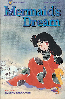
The 40 Years of Comics Project - Day 709: Mermaid's Dream #3, 1995
I think this is the first comic I've read from this quarter bin collection I picked up that has made me want to go and track down the rest of the series. It's got that lovely, dark sensibility that only the cute style of manga can achieve. It seems at once adorable and sinister, and puts me in mind of the fantastic Mushishi. The story appears to have to do with characters becoming immortal after eating a mermaid's heart. All I can picture in my head is a typical manga badass cleaving poor Ariel in twain and eating her liver. Which, all things considered, is a pretty comical image. Don't judge.
The artwork is stark, which nicely reflects the characters' internal landscapes. The immortals are trapped in a world that is at once familiar and foreign, and what we're obviously seeing is individuals coming to realize the ramifications of living forever. One imagines it would be lonely.
As I say, I'm intrigued by the series. This is the final issue of this particular adaptation, though the whole Mermaid Saga has been collected in traditional manga form. I may have to see about tracking it down. It also turns out that Ms. Takahashi is responsible for the very successful Inu Yasha, though I think Mermaid is slightly darker than that series. The art style is the same, however.
I feel like I just don't know enough about manga to give a decent reading of it. Is this good? Is it doing what manga does well, or doing what manga is capable of? It drew me in, even with relatively little dialogue or plot. In a purely aesthetic sense, it's quite spectacular. I guess I'll have to wait until I find the full story to say anything about the narrative. The hunt, as always, is on!
To be continued.
Feb 2, 2017
The 40 Years of Comics Project - Day 708: Vanity #1, June 1984
This morning, as I was explaining some superhero costume tropes to my class, I mentioned the ever-classy "boob window." Vanity, our title character up there, is a prime example.This explanation was in response to a discussion of Erik Larsen's horrendous tweet about women and practical outfits in comics. Another excellent comics creator is outed as sexist POS. Pity.
This is a weird comic. I can only find 3 appearances for the character. Two are her own series, and one is in Pacific Presents #3. An interesting premise. She's got science fiction tech but exists in contemporary times, and is apparently a time-displaced cave person. That's literally all I can get from it. Will Meugniot's art is quite lovely, and Vanity and her cohorts are rendered expertly. It's nice to see, on the first page, that the male characters also evince "boob window." At least the comic is equal opportunity as far as the amount of flesh it bares. Vanity it obviously inspired by old science fiction exploitation films, with a healthy dash of pin-up girl thrown in. She's part spy, part superhero, part sex symbol, and I'm curious to know how the story ends up. Well, if it ends up, I guess. The GCD says it "was" an ongoing series, but I'm not sure we can say that two issues is ongoing. More like aborted. And, as with many series from this era, I'm sure it simply disappeared with no explanation.
Pity.
Onward.
Feb 1, 2017
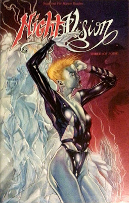
The 40 Years of Comics Project - Day 707: Nightvision #3, 1993
Purely by coincidence, today's comic is written by David Quinn who, along with yesterday's artist Tim Vigil, created Faust, one of the most notorious of the brutally violent comics to come out in the late 80s and early 90s. I can see the links. Vigil's art is blood-spattered, and Quinn's writing is pushing at that bottom of Goth-y darkness, forcing it deeper. The story itself is a bit confusing, for in media res reasons, but it seems to be a vampire hunting story. Sort of. Hannibal King's art is good, though is a bit clean for my liking, especially considering the subject matter of the story. There's a back-up story, with no artist mentioned, that's a dingier take on the setting and characters, and that, for me, fits the tone of the tale more properly.
Goth comics are interesting. They seem to skew in a couple of very definite directions. They're either the vampire-celebratory gore-fests, like Faust, or anything from Full Bleed Studios, or they're the very dark comedies that we see in something like Johnny the Homicidal Maniac or (After)Life in Gothland. The only series I can think of that straddles the two, though with decidedly less gore, is Gloomcookie, that gives us some vampiric monsters, some satire, and a nice healthy dose of gothy love. That mixture is probably why, of all the Goth comics I've read, Gloomcookie's my favourite. Guess I should probably get back to my weekly graphic novels so I can actually read that series again.
Onward!
Subscribe to:
Comments (Atom)
