Thoughts, reviews, rants, laments, and general chatting about the wonderful world(s) of comic books.
Apr 8, 2016
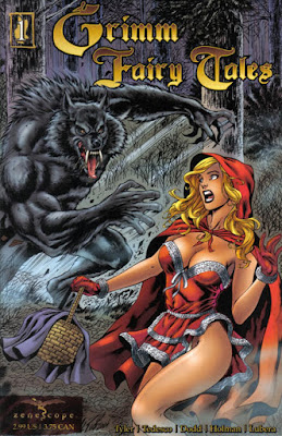
The 40 Years of Comics Project - Day 409: Grimm Fairy Tales #1, June 2005
A student of mine wrote a paper for the end of term comparing Zenescope's adaptation of Alice's Adventures in Wonderland with the original, and made observations about the way dream imagery becomes darker and more sinister when a character cannot escape the dream. A very cool idea, and she demonstrated it fairly well.
But we've been talking about the Grimm Fairy Tales adaptations for a couple of weeks now in meetings, and how bizarre they are. In some respects, they're pretty neat little takes on the classic fairy tales, adding an element of horror that has always been a part of these sorts of interpretations. But, as you can see from the above cover, there's also a pretty gratuitous amount of T&A. Now, this, in and of itself, is not an uncommon combination, but there's actually a chance that these stories could have some real literary merit, if it were not for the constant thong-shots, heaving, barely contained bosoms, and perfectly-toned California beach bodies. I'll admit that when I bought this comic, when it came out, there was probably something about that cover that pulled me in. I may try to be intellectual about comics a lot of the time, but I am also a human being who enjoys the aesthetic side of our species too. Here's the strange thing, though: inside the comic, there is actually little of this kind of exploitation. In fact, though fairly predictable, the story is pretty much a straight up horror tale. At the time, I was unimpressed with it, but on reflection now, the predictability that I disliked initially now seems to be a function of the source material. A fairy tale is so familiar that there's always going to be an element of predictability to an adaptation. Perhaps that's not why we watch them. It's like with Shakespeare - it's not what happens, because we all know what happens, but how what happens is depicted.
On that front, again, this comic's not fantastic. But it's getting there. First issues are like first seasons on television. It takes a while for a book to find its footing. The series continues to this day, as far as I know, but the interior artwork has come to more closely match the exterior, though still retains the horror elements. I think the best analogy for this series' genre I can think of is the best of the 80s slasher horror movies. Somehow it's always sex and death, isn't it, spiraling around one another, infinitely.
Onward.
Subscribe to:
Post Comments (Atom)

No comments:
Post a Comment